The Radio Option provides the user with clear option to chose from in a short list. They are primarily used in forms. Only one RadioOption can be chosen at a time.
Variants
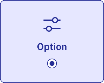
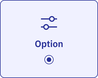
Row
The default appearance for radio options.
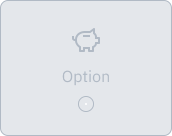
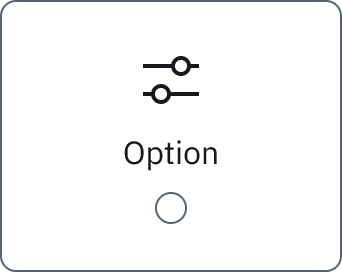
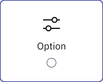
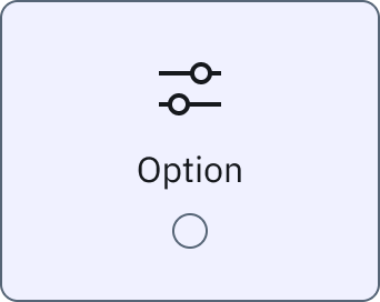
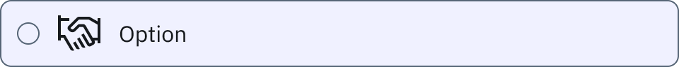
Row & Graphic
Used when a graphic is available to display within the option.
Icons and graphics help the user identify the option quicker.
Column
Used only for mobile devices.
Can be placed into two columns so options appear side by side.
Increased area to tap easily on smaller screens.
Anatomy
Radio Option (Row)

- Radio 16x16px
- Left align 16px IBM Plex Sans Regular
- Padding 12px
- Space 12px
- 480px width
Radio Option (Row & Graphic)

- Radio 16x16px
- Icon 32x32px
- Left align 16px IBM Plex Sans Regular
- 8px, 12px, 8px, 12px padding
- Space 12px
- Space 12px
- 480px width
Radio Option (Column)

- 24px, 12px, 24px, 12px padding
- Icon 32x32px
- Space 8px
- Centre align 16px IBM Plex Sans Regular
- Space 8px
- Radio 16x16px
- 171px width
States